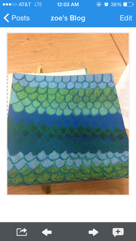
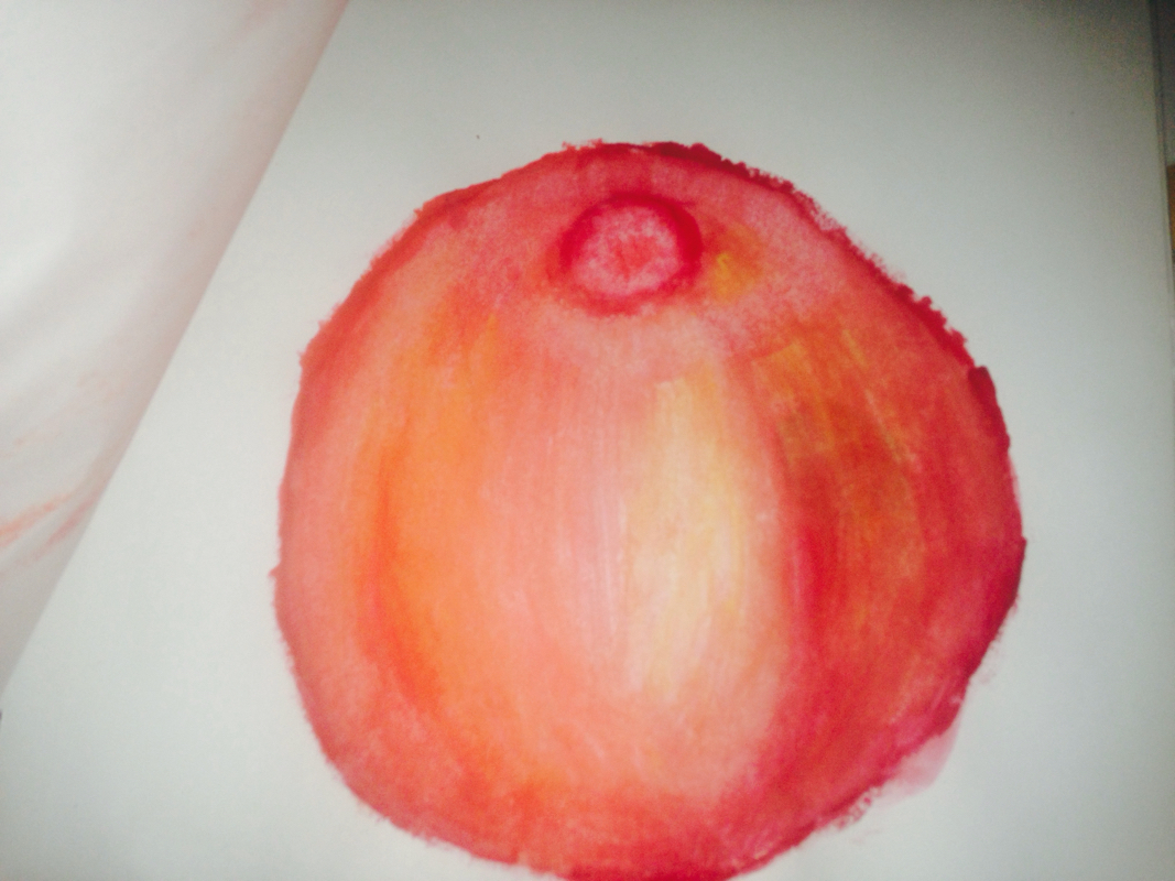
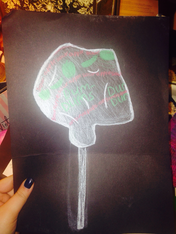
My favorite medium to work with was the oil pastels. I love the way you can represent different values easily by using a blending stick to make the color go from light to dark. You do not need to do layer upon layer to get the color to be thick because it comes on so thick and rich in color. I love how it looks on black paper and how the color always seems to stand out. The only thing I wish was different about the oil pastel is how easily it is to get seamered or ruined by rubbing it against something accidentally.
My favorite mini lesson was our very last one, with the water color. I had never really worked with water color before and I'm not one who really enjoys to work with paint very often when I do crafts. Watching the video of all the different techniques was cool because we got to see a step by step process without crowding around a table and trying to see. I liked practicing the different methods and my favorite one was the wet on wet. Dry brush was cool as well because you had more control over the paint and where it went. I thought it was cool you could use things like salt and Saran Wrap to add texture because that's something I would never think to do I liked being able to see the apple done by ms Rossi while doing my own to help me. I learned to use colors like yellow and green to really high light the different values within the apple. I esepically liked how you could combine all the different techniques within one project Another mini lesson that taught me a lot was the perspective drawings. I remember in art 1, I struggled a lot with the whole drawing the building from the corner thing. But in Art 2, I really benefitted from it, especially when we went outside and actually sat down in front of a building and drew it. With some practice, I think I became really good at showing perspective While looking at my work in my sketch book and my projects I noticed the most difference within the mini lesson of contour line drawing. When looking at this hand, it's clear to see I had no idea what I was doing and wasn't paying to details. The hand isn't realstic, it lacks value, and it looks very rushed. One thing I learned about countour line drawing is that you have to take your time and really pay attention to what you're looking at. After doing these for a few days, I think I made some major improvements with the line drawing. Even though my second one doesn't look as realstic as it could, it's still a much better job then my first few. I learned to pay attention to details I may have not saw at first and made sure to add value. The lines within the hand make it seem more realstic and you can tell its a hand. The best part I think is the pinky area. The lines within show that it is a 3D shape and that it isn't flat on the page. The project I feel the less sucessful on is the color pencil dum-dum. To me it does not look realstic whatsoever, it's hard to tell that it's a wrapper on top of it. If I was to change it, I would add different values to add more dimension and to show all the different creases. I did enjoy however, working on the black paper verses the white. I think it really makes all the colors pop and stand out more then they normally would. But for me, I think it would beneficial to have more practice with the color pencils so I could really enhance the colors to make them actually represent the shapes and sizes of the wrapper. I would change how you can't tell that it's a 3D object and it's wrapping around completely. To do this I again would add more values to the edges and go darker as it goes down to show a light source which my project was strongly lacking. Overall, I think it was just a lack of values within the project that reallly created the downfall. The project that I think I was most sucessful and proud of is the mix media collage project. When I started this project, I wrote down 10 ideas and ended up picking the theme of "travel". I sketched out what I wanted my final piece to look like and began to work. I used a basic white sheet of paper and applied gesso to it with a paint brush to add some texture to it. I then put down a bunch of tissue paper and then wet it with water and a paint brush so the color would leak through. I think that this added more defintion to my project and created a nice background. I then used a method called photo transfer and used gel medium to hold down a picture I cut out of the Eiffel Tower. Then I went back over with the tissue paper to even further the color and different values. If i didn't have done the second round of tissue paper painting, their would have been more hard edges and look less blended. The project that I think I was most sucessful and proud of is the mix media collage project. When I started this project, I wrote down 10 ideas and ended up picking the theme of "travel". I sketched out what I wanted my final piece to look like and began to work. I used a basic white sheet of paper and applied gesso to it with a paint brush to add some texture to it. I then put down a bunch of tissue paper and then wet it with water and a paint brush so the color would leak through. I think that this added more defintion to my project and created a nice background. I then used a method called photo transfer and used gel medium to hold down a picture I cut out of the Eiffel Tower. Then I went back over with the tissue paper to even further the color and different values. If i didn't have done the second round of tissue paper painting, their would have been more hard edges and look less blended. Because I liked this project so much, I wanted to do a second one using the same concept and techniques but wanted to add more. Instead of just plain white paper, I decided to add a bunch of cut up newspaper strips to add a different looking background. I used the same method of photo transfer and applied another picture of the Eifell tower. Overall, I think my first project was better because it was more simple and just pretty. I decided to get my picture framed, and it makes a great decoration for my living room. The project that I think I was most sucessful and proud of is the mix media collage project. When I started this project, I wrote down 10 ideas and ended up picking the theme of "travel". I sketched out what I wanted my final piece to look like and began to work. I used a basic white sheet of paper and applied gesso to it with a paint brush to add some texture to it. I then put down a bunch of tissue paper and then wet it with water and a paint brush so the color would leak through. I think that this added more defintion to my project and created a nice background. I then used a method called photo transfer and used gel medium to hold down a picture I cut out of the Eiffel Tower. Then I went back over with the tissue paper to even further the color and different values. If i didn't have done the second round of tissue paper painting, their would have been more hard edges and look less blended. |