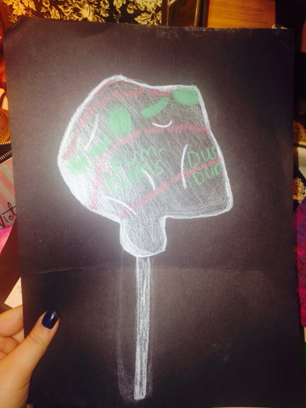
The project I feel the less sucessful on is the color pencil dum-dum. To me it does not look realstic whatsoever, it's hard to tell that it's a wrapper on top of it. If I was to change it, I would add different values to add more dimension and to show all the different creases. I did enjoy however, working on the black paper verses the white. I think it really makes all the colors pop and stand out more then they normally would. But for me, I think it would beneficial to have more practice with the color pencils so I could really enhance the colors to make them actually represent the shapes and sizes of the wrapper. I would change how you can't tell that it's a 3D object and it's wrapping around completely. To do this I again would add more values to the edges and go darker as it goes down to show a light source which my project was strongly lacking. Overall, I think it was just a lack of values within the project that reallly created the downfall.
 RSS Feed