While looking at my work in my sketch book and my projects I noticed the most difference within the mini lesson of contour line drawing.
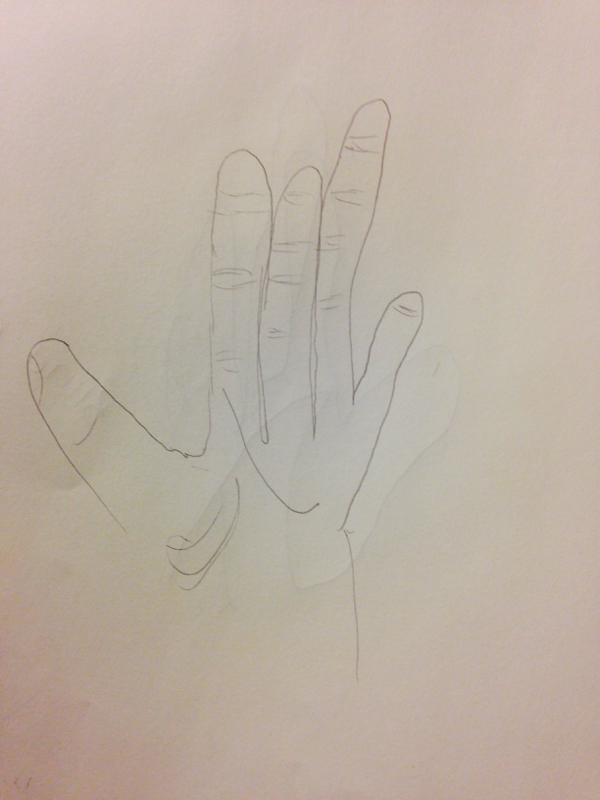
When looking at this hand, it's clear to see I had no idea what I was doing and wasn't paying to details. The hand isn't realstic, it lacks value, and it looks very rushed. One thing I learned about countour line drawing is that you have to take your time and really pay attention to what you're looking at.
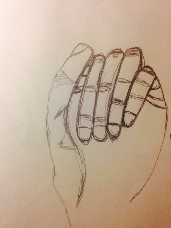
After doing these for a few days, I think I made some major improvements with the line drawing. Even though my second one doesn't look as realstic as it could, it's still a much better job then my first few. I learned to pay attention to details I may have not saw at first and made sure to add value. The lines within the hand make it seem more realstic and you can tell its a hand. The best part I think is the pinky area.
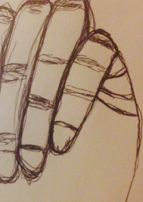
The lines within show that it is a 3D shape and that it isn't flat on the page.
 RSS Feed